

In Progress
KadePay - Fintech Startup
KadePay is a payment processing platform designed to help small businesses accept payments quickly and easily. While the original website communicated the product’s purpose, it suffered from UX and UI flaws that limited clarity, usability, and trust. My role as a UI/UX Design Intern was to identify these issues and propose a redesigned experience that better serves the needs of KadePay’s target users.
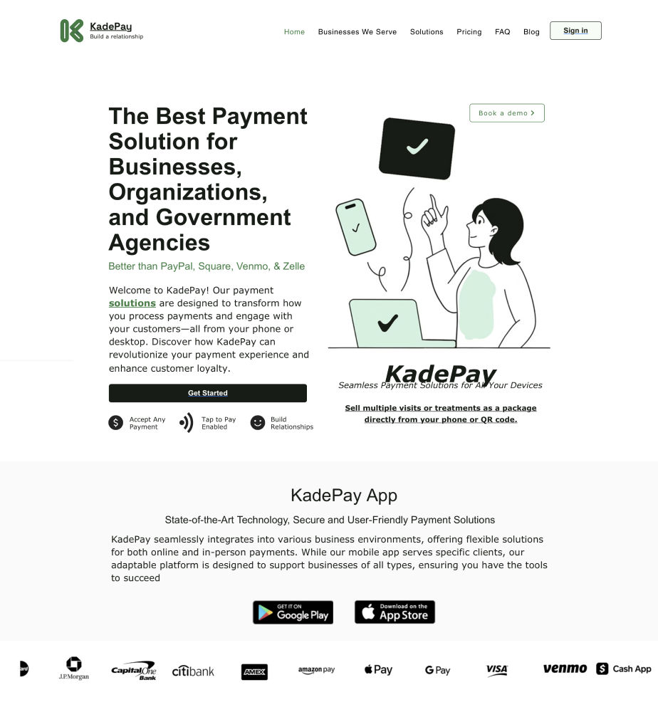
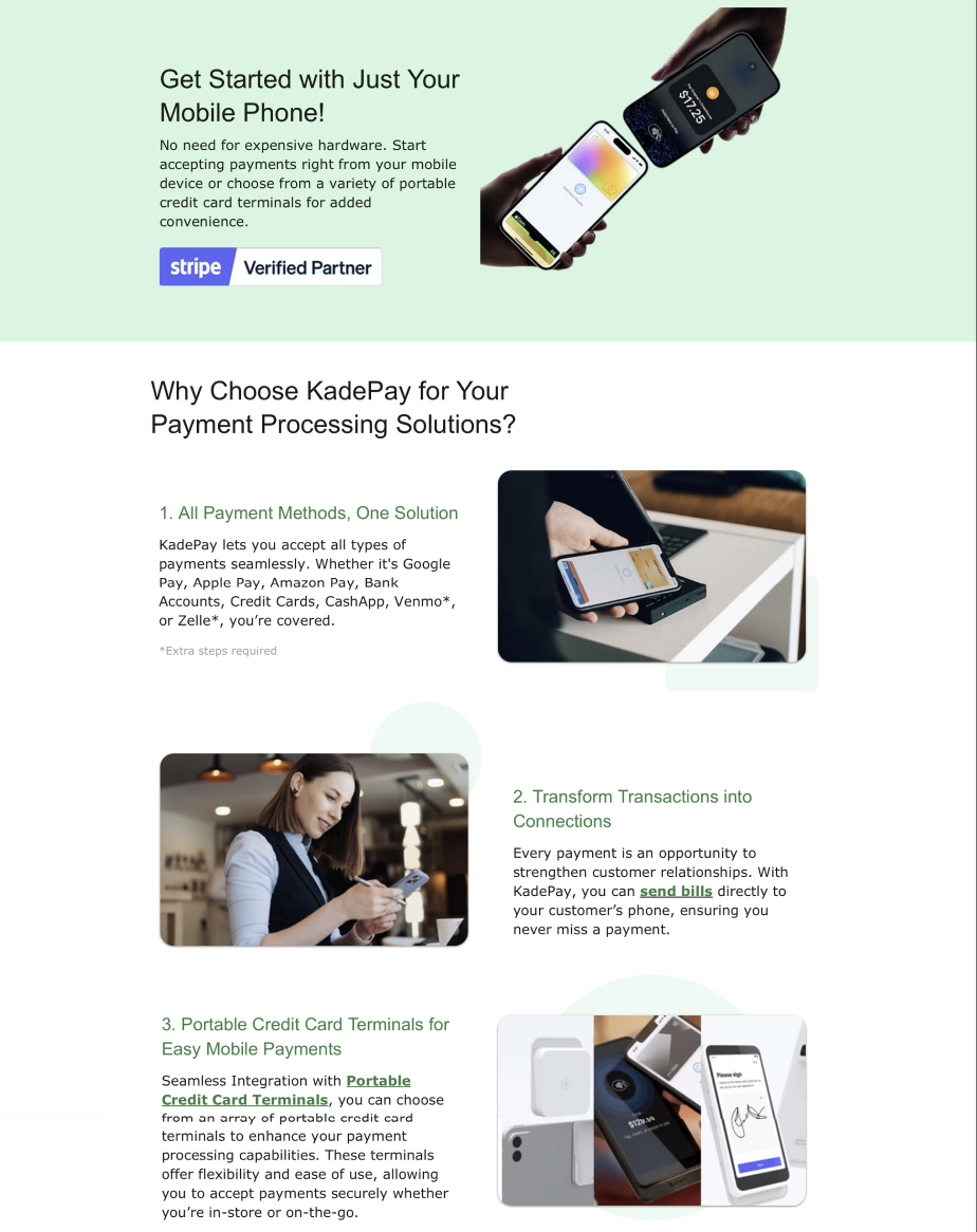
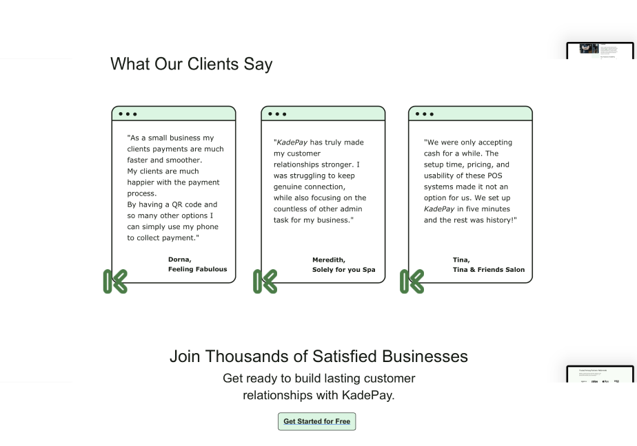
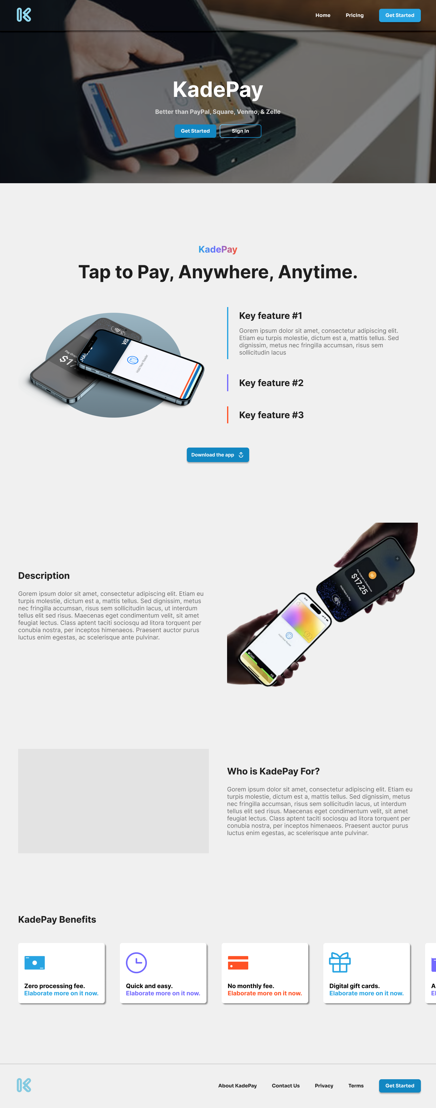
Current KadePay Website
Problem
The original website had several critical usability problems:
- Overloaded Messaging: The copy attempted to appeal to every type of business, organization, and even government agencies. This broad approach left users uncertain about who the product was really built for.
- Cluttered Layout & Visual Noise: Multiple font sizes, icons, and overlapping feature explanations created unnecessary repetition and made the site harder to scan. Testimonials were text-heavy and lacked emphasis.
- CTA Confusion: Competing calls-to-action (“Get Started,” “Get Started for Free,” “Book a Demo”) made it unclear which step users should take, especially for first-time visitors.
- Accessibility Gaps: Light green backgrounds with small gray text reduced readability. Decorative icons distracted from content without adding functional value.
- UI Weaknesses: Reliance on stock imagery, inconsistent spacing, and overuse of bold/italic text made the site feel less authentic and less polished.
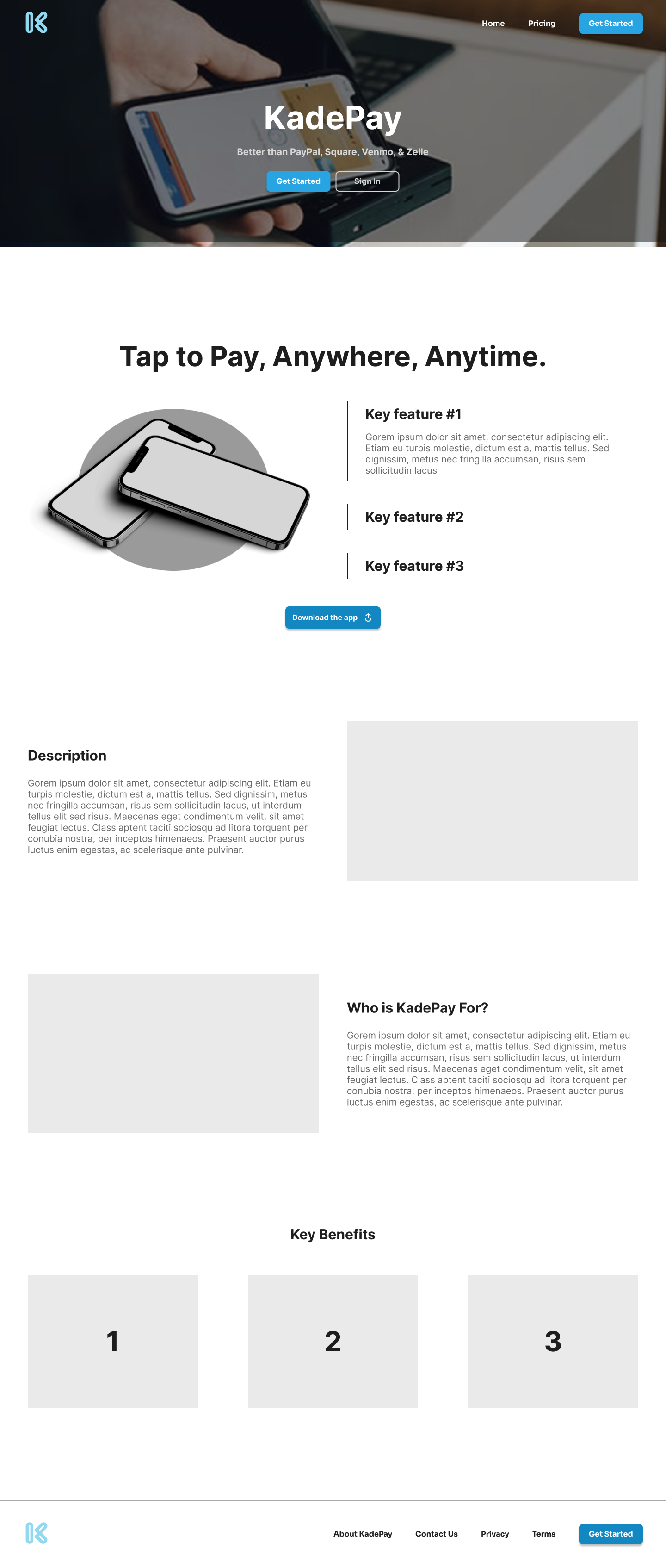
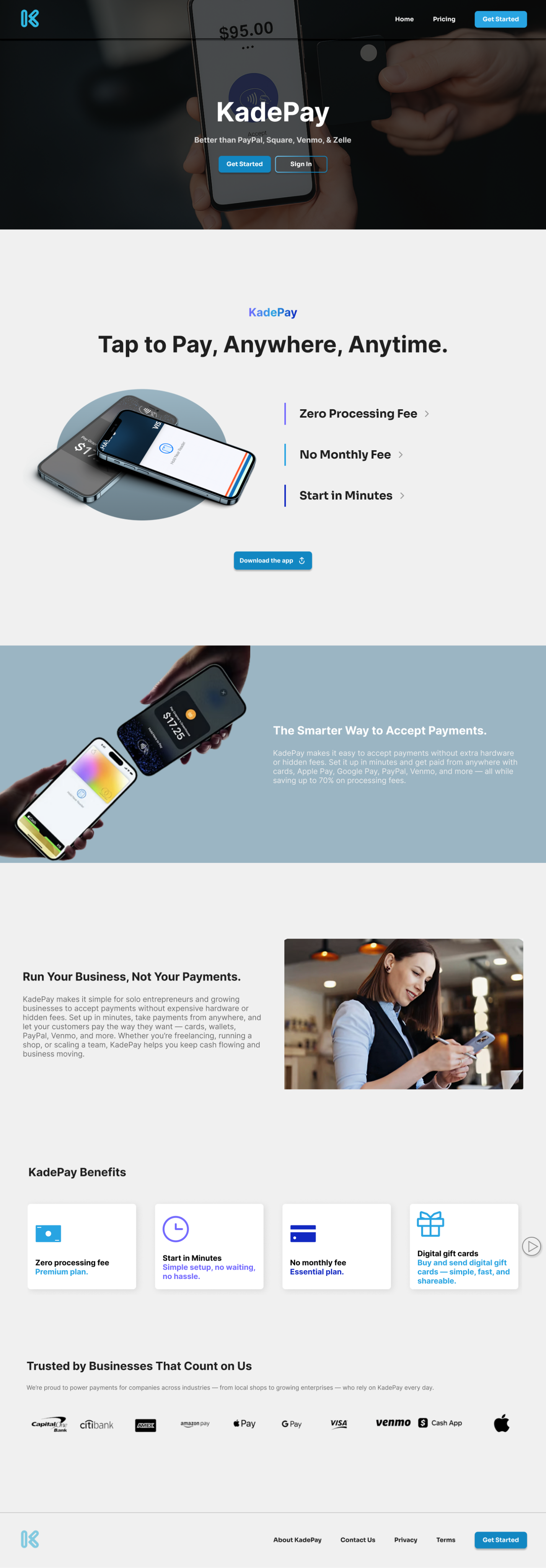
Initial Wireframes
To begin, I created low-fidelity wireframes that focused on information hierarchy and user flow rather than visual details. The goal at this stage was to simplify the messaging and restructure the layout to make it easier to scan.
Key decisions in the wireframes included:
- Introducing a benefits section with iconography to replace repetitive feature explanations.
- Using white space strategically to reduce visual noise and guide the eye down the page.
- Designing the first visual touchpoint to clearly explain what KadePay is and highlight its key benefits.
These wireframes helped validate the direction before investing time in high-fidelity designs.
Post-feedback designs
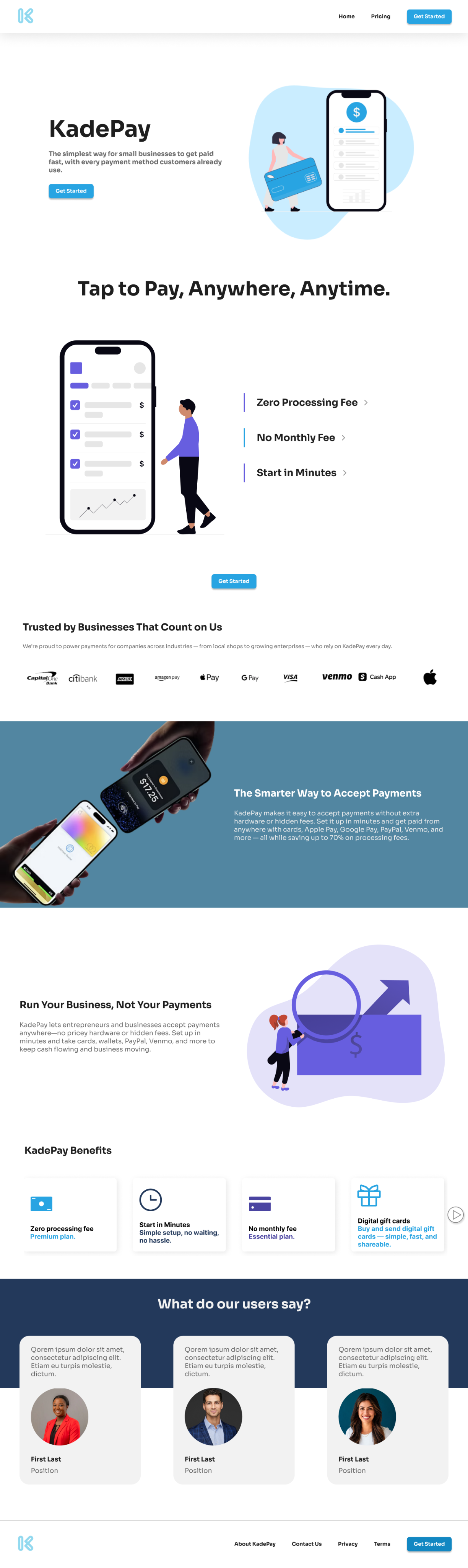
After presenting the wireframes to stakeholders, I refined them into high-fidelity mockups based on feedback. The main priorities were to make the site more welcoming, trustworthy, and aligned with the brand, while maintaining accessibility. I incorporated more illustrations to create a friendly feel and simplified the calls-to-action to one clear ‘Get Started’ button.
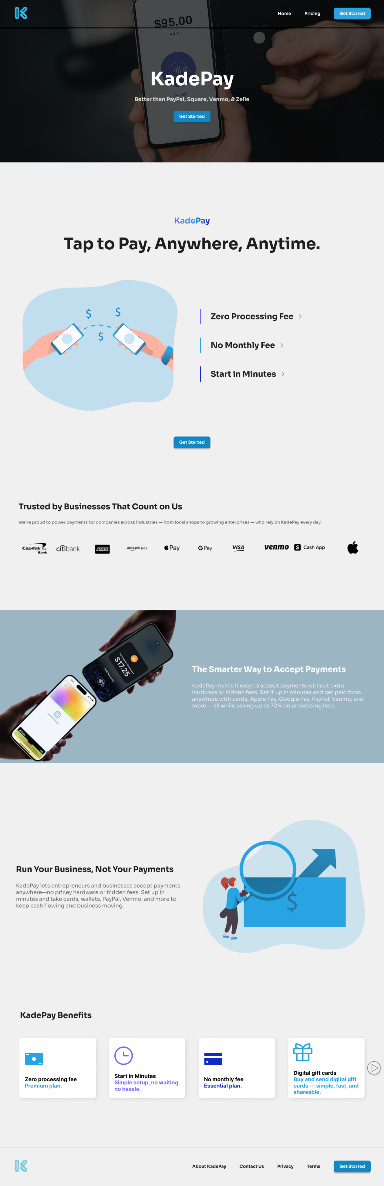
Solution
The redesign focuses on clarity, accessibility, and trust-building through the following improvements:
- Targeted MessagingThe copy was rewritten to directly address small businesses, the platform’s true audience. Phrases like “The simplest way for small businesses to get paid fast” immediately signal relevance and build connection.
- Simplified LayoutInstead of spreading features across multiple sections, they are consolidated into a clean “KadePay Benefits” block. White space and consistent spacing reduce clutter, while modern illustrations replace long testimonial text, making the site easier to skim.
- Streamlined CTAsThe site now centers on one clear call-to-action: “Get Started.” This consistency removes decision fatigue and guides users seamlessly toward conversion.
- Accessibility EnhancementsHigh-contrast color choices (dark text on light backgrounds) improve readability. Headings and body text are visually distinct, while illustrations replace decorative icons, creating both functional and accessible design elements.
- UI RefinementsStock imagery was minimized in favor of custom illustrations and product-focused visuals, making the brand feel more authentic. Improved spacing and alignment in cards, testimonials, and benefits sections create a professional, polished appearance. Typography was streamlined to use fewer weights, establishing a clearer hierarchy.
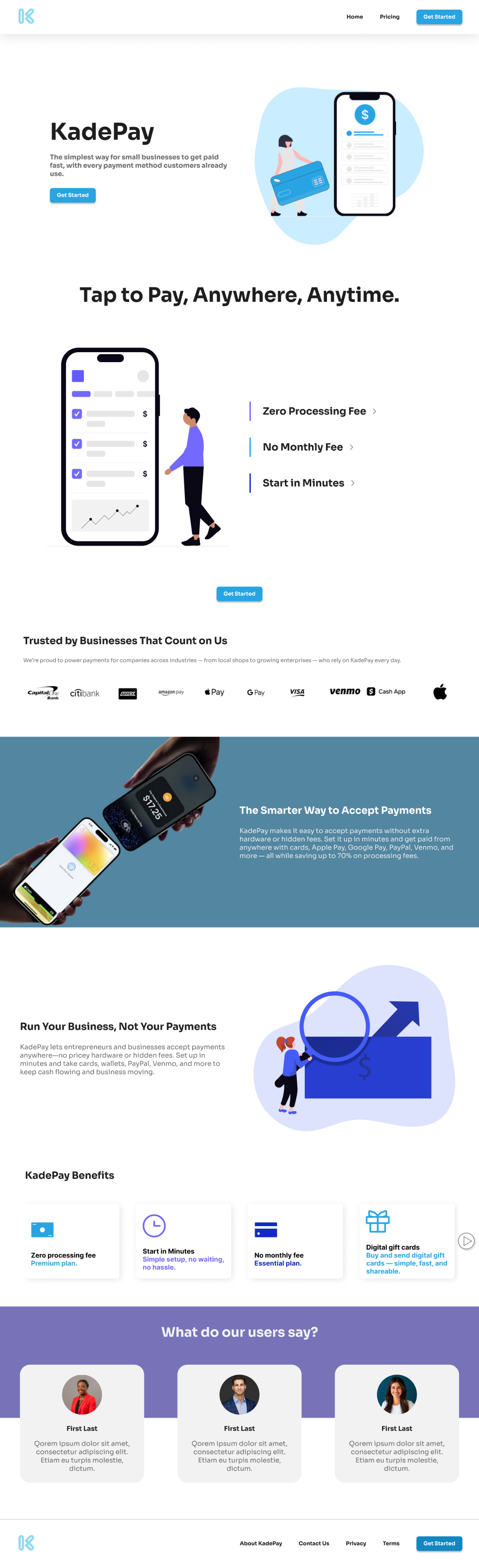
Outcome
The redesigned KadePay website is shaping up to be cleaner, more focused, and more user-friendly. Early iterations show strong improvements in narrowing the messaging to small businesses, simplifying the layout, and unifying the call-to-action to reduce friction in the user journey. Accessibility refinements and a more polished visual system are helping the site communicate its value with greater clarity and professionalism.
This project is still a work in progress, and I continue to test, gather feedback, and refine the design. Future iterations will focus on strengthening visual consistency, adding real customer testimonials, and validating design choices through usability testing to ensure the final product best supports KadePay’s users.
Other Projects

In Progress
KadePay - Fintech Startup
KadePay is a payment processing platform designed to help small businesses accept payments quickly and easily. While the original website communicated the product’s purpose, it suffered from UX and UI flaws that limited clarity, usability, and trust. My role as a UI/UX Design Intern was to identify these issues and propose a redesigned experience that better serves the needs of KadePay’s target users.
Current KadePay Website
Problem
The original website had several critical usability problems:
- Overloaded Messaging: The copy attempted to appeal to every type of business, organization, and even government agencies. This broad approach left users uncertain about who the product was really built for.
- Cluttered Layout & Visual Noise: Multiple font sizes, icons, and overlapping feature explanations created unnecessary repetition and made the site harder to scan. Testimonials were text-heavy and lacked emphasis.
- CTA Confusion: Competing calls-to-action (“Get Started,” “Get Started for Free,” “Book a Demo”) made it unclear which step users should take, especially for first-time visitors.
- Accessibility Gaps: Light green backgrounds with small gray text reduced readability. Decorative icons distracted from content without adding functional value.
- UI Weaknesses: Reliance on stock imagery, inconsistent spacing, and overuse of bold/italic text made the site feel less authentic and less polished.
Initial Wireframes
To begin, I created low-fidelity wireframes that focused on information hierarchy and user flow rather than visual details. The goal at this stage was to simplify the messaging and restructure the layout to make it easier to scan.
Key decisions in the wireframes included:
- Introducing a benefits section with iconography to replace repetitive feature explanations.
- Using white space strategically to reduce visual noise and guide the eye down the page.
- Designing the first visual touchpoint to clearly explain what KadePay is and highlight its key benefits.
These wireframes helped validate the direction before investing time in high-fidelity designs.
Post-feedback designs
After presenting the wireframes to stakeholders, I refined them into high-fidelity mockups based on feedback. The main priorities were to make the site more welcoming, trustworthy, and aligned with the brand, while maintaining accessibility. I incorporated more illustrations to create a friendly feel and simplified the calls-to-action to one clear ‘Get Started’ button.
Solution
The redesign focuses on clarity, accessibility, and trust-building through the following improvements:
- Targeted MessagingThe copy was rewritten to directly address small businesses, the platform’s true audience. Phrases like “The simplest way for small businesses to get paid fast” immediately signal relevance and build connection.
- Simplified LayoutInstead of spreading features across multiple sections, they are consolidated into a clean “KadePay Benefits” block. White space and consistent spacing reduce clutter, while modern illustrations replace long testimonial text, making the site easier to skim.
- Streamlined CTAsThe site now centers on one clear call-to-action: “Get Started.” This consistency removes decision fatigue and guides users seamlessly toward conversion.
- Accessibility EnhancementsHigh-contrast color choices (dark text on light backgrounds) improve readability. Headings and body text are visually distinct, while illustrations replace decorative icons, creating both functional and accessible design elements.
- UI RefinementsStock imagery was minimized in favor of custom illustrations and product-focused visuals, making the brand feel more authentic. Improved spacing and alignment in cards, testimonials, and benefits sections create a professional, polished appearance. Typography was streamlined to use fewer weights, establishing a clearer hierarchy.
Outcome
The redesigned KadePay website is shaping up to be cleaner, more focused, and more user-friendly. Early iterations show strong improvements in narrowing the messaging to small businesses, simplifying the layout, and unifying the call-to-action to reduce friction in the user journey. Accessibility refinements and a more polished visual system are helping the site communicate its value with greater clarity and professionalism.
This project is still a work in progress, and I continue to test, gather feedback, and refine the design. Future iterations will focus on strengthening visual consistency, adding real customer testimonials, and validating design choices through usability testing to ensure the final product best supports KadePay’s users.
Other Projects